John Havemann
design

Logos : Various clients
Branding goes beyond just a logo, but a quality logo needs to say so much with very little. [ click a logo to enlarge ]


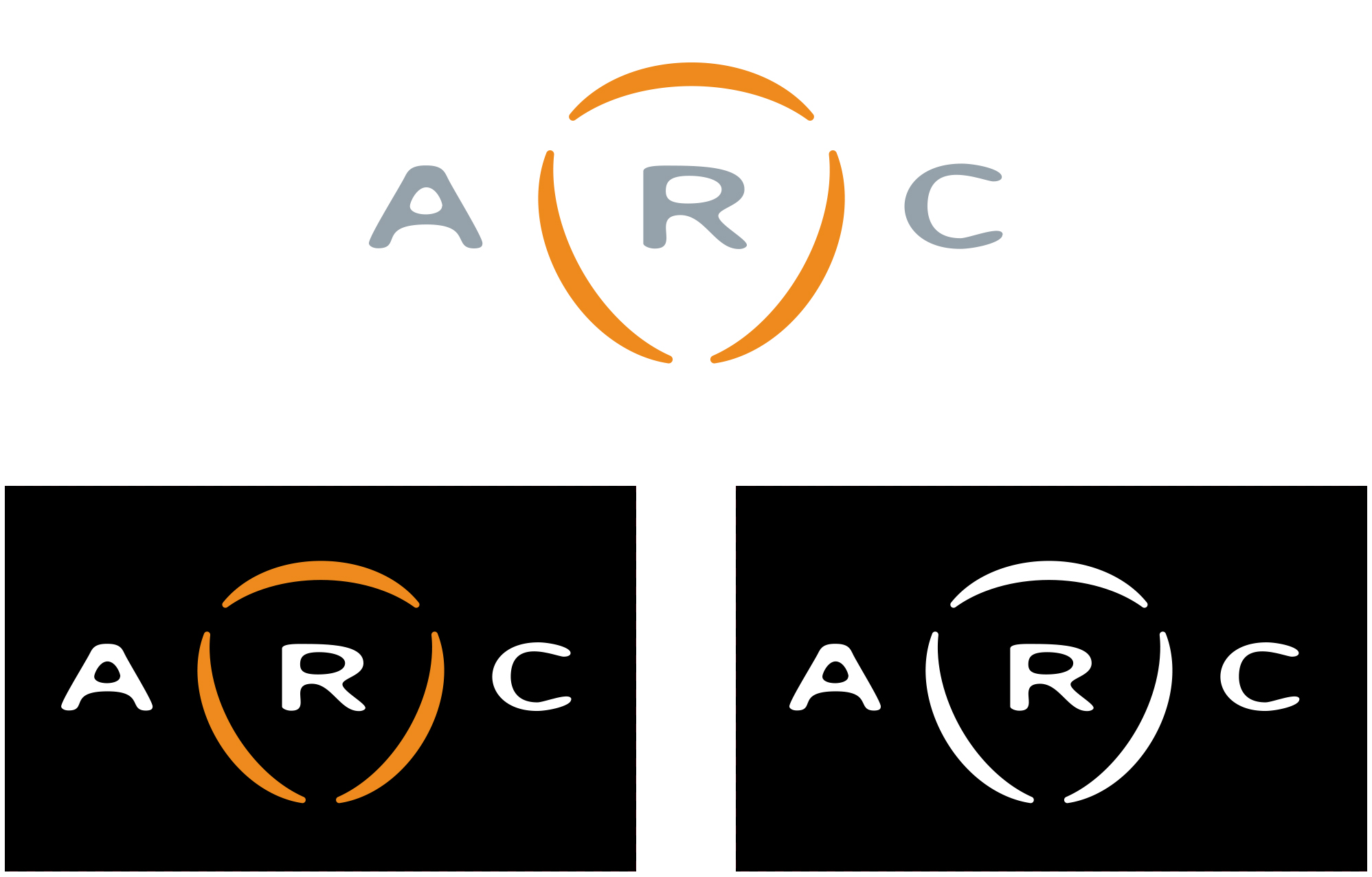
Corporate Identity : Arc Worldwide
The logo is only as strong as the support behind it. The identity structure needs to be supportive to the logo to continue the brand. Here the logo works in multiple colors for different situations. The letterhead is kept simple, but has appeal. Business cards have a unique shape to continue the arc theme. The envelopes were designed to be provided flat to the client and folded when needed. The only glue used was on the flap to keep it closed.


Trading Cards : U.S. Army
Inspired by baseball cards, these pieces were designed to show potential recruits and their families what the U.S. Army had to offer in a unique way. From individual soldier positions to vehicles and weapons, these cards were created to be informative and shared.


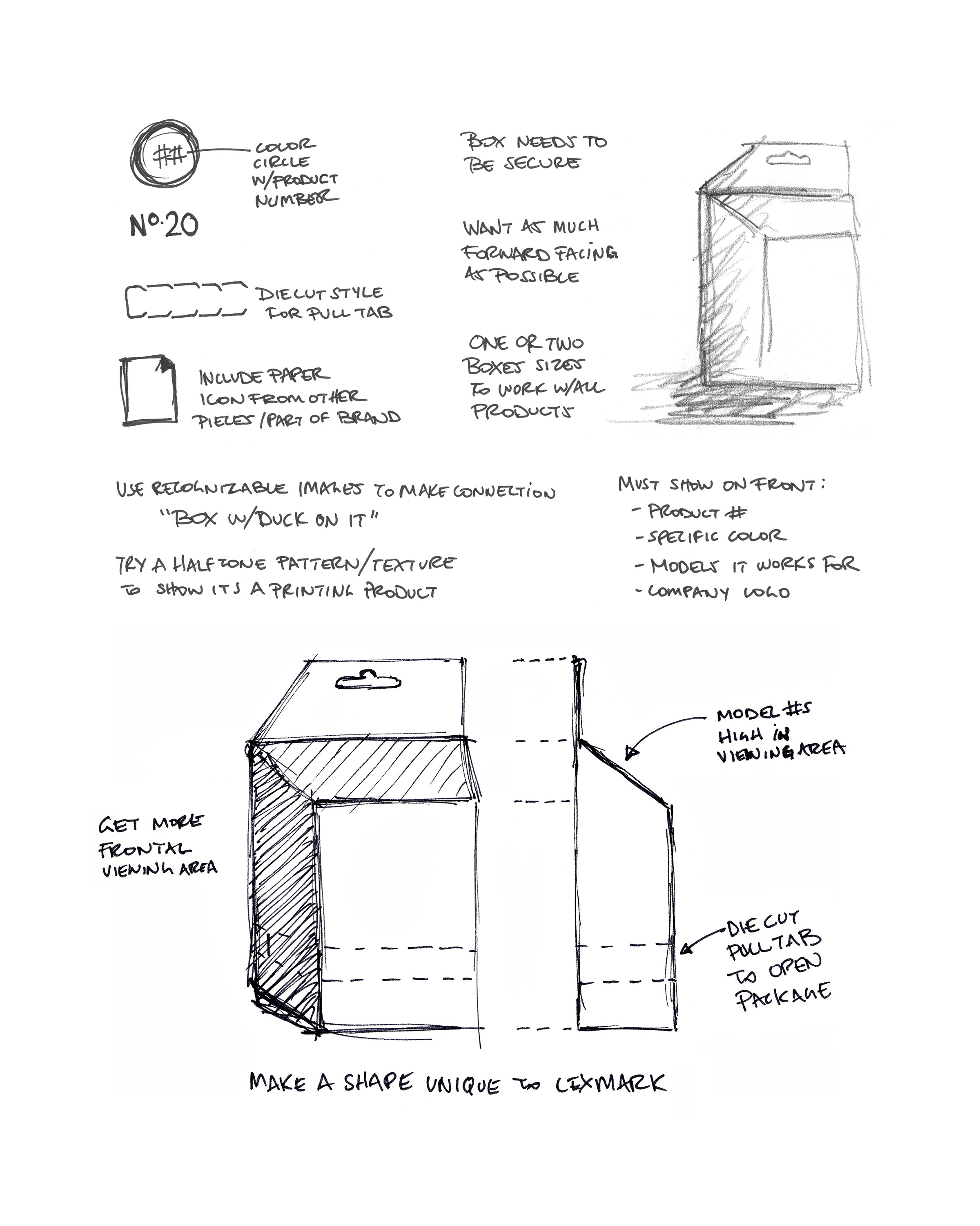
Packaging : Lexmark
This package was designed to have more front facing area while taking up the same amount of shelf space. The challenging part of this project was the requirement of being tamper proof while having easy product identification for the consumer.